Auditing our way onto a new design system
My role
Product Designer
Timeframe
1.5 weeks, side-of-desk
Tools
Figma Plugin API, TypeScript
The situation
We rolled out a new design system, and every app screen had to move onto it.
The screens split into two groups. Anything people were actively working on — current features, live user journeys — was already being built with the new components, because that's what everyone reached for by default. The problem was everything else: older flows and use cases that nobody had touched in a while. Those still had to be migrated, and there was a lot of it.
Some of those older designs were built by designers who had already left. Nobody owned them anymore. They'd survived that long because they sat away from the main areas of the app, so no one had a reason to open them — until now, when “migrate everything” meant everything.
Why it wasn't a simple find-and-replace
The obvious idea is to map each old component to its new equivalent and swap them. That falls apart here for one reason: there was no old design system to map from.
The old screens weren't built on a system. People had hand-built inputs, labels, cards, and list items directly, each one slightly different, named however the person naming it felt that day. There was no clean “old Button → new Button” relationship because there was no “old Button” as a defined thing. Before anything could be migrated, the mess had to be found and consolidated.
So the real question wasn't “how do we swap components.” It was “how does a designer even see, on a given screen, what's already on the system and what's a leftover hand-built thing pretending to be a component.” On a dense screen, by eye, that's slow and easy to get wrong.
What I built
I made a Figma plugin that answers exactly that question. Select a screen (or several, or a whole page) and it tells you what on it does not belong to the design system.
The plugin points; the designer decides. Nothing on the canvas changes unless a person changes it.
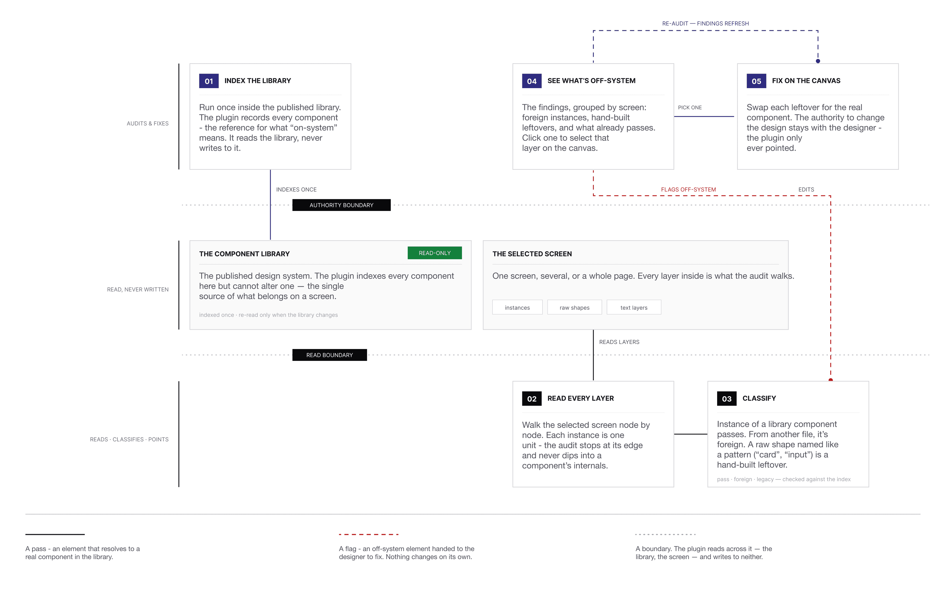
The result is a list, grouped by screen, of everything that needs attention, with a toggle to also show what's already passing. Click any item and it selects that layer on the canvas so you can go fix it.
One detail that mattered more than expected: the plugin treats each component instance as a single unit and doesn't dig into its internal layers. An early version walked inside instances and started flagging their internal parts — a text layer named “Label” inside a perfectly good Button — which produced noise and confusing results on anything using variants. Stopping at the instance boundary fixed it.
How it landed
Designers could scan a screen and immediately see what was on the system and what wasn't, instead of squinting at layers one by one. What used to be a slow manual read became a quick pass, and the leftover hand-built elements — the ones with no owner and no obvious “this is wrong” signal — surfaced on their own. The team was able to move through the backlog of old flows far faster, and the feedback was that it made a tedious job actually manageable.
Four designers used it to migrate cash, savings, and investments products, along with the older flows nobody had been looking at. A couple of hundred screens moved onto the new system, and the time it took to get through each one dropped by close to half.